The Decision That Paralyzes Everyone
Standing in a paint shop staring at a fan deck of 200 shades is genuinely overwhelming. Knowing how to choose paint color properly isn’t about finding the “perfect” shade — it’s about matching color to light, room function, and how the space actually gets used.
1. Start With the Room’s Natural Light
North-facing rooms get cooler, softer light and can handle warmer wall tones well. South and west-facing rooms get stronger, warmer light, so cooler tones tend to balance them better instead of feeling overly hot.
Quick answer: The most important factor in how to choose paint color is the room’s natural light direction — north-facing rooms suit warmer tones, while south or west-facing rooms often look better balanced with cooler shades.
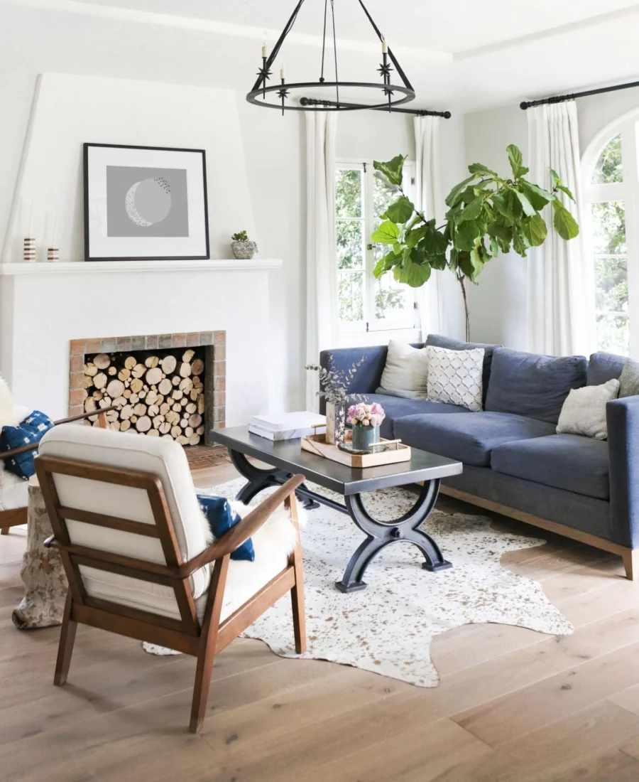
2. Living Rooms — Go Warm and Welcoming
Living rooms benefit from warm neutrals — soft beige, warm greige, or muted terracotta tones. These colors read as inviting rather than cold, and they pair easily with most furniture and decor styles.
3. Bedrooms — Prioritize Calm Over Bold
This is one room where I’d genuinely steer people away from trendy bold colors. Soft blues, sage greens, and muted lavenders consistently test better for actual sleep quality and daily calm than vibrant, high-energy shades.
4. Kitchens — Consider Practicality Alongside Style
Light, easy-to-clean colors work well here since kitchens see more splatters and staining than any other room. Soft whites, pale yellows, and light greys are popular for good reason — they hide daily wear reasonably well.
5. Bathrooms — Go With Moisture-Friendly Finishes
Color matters less here than finish. A satin or semi-gloss finish resists moisture and mildew far better than matte, regardless of which shade you pick.
Quick answer: For bathrooms specifically, choosing the right finish (satin or semi-gloss for moisture resistance) matters just as much as the color itself — a beautiful matte finish that peels from humidity within a year defeats the purpose.
6. Accent Walls — Use Sparingly, With Intention
One accent wall in a bold or dark shade can genuinely elevate a room’s character, but two or more in a small space tends to feel chaotic rather than intentional. Pick the wall the eye naturally lands on first.
7. Test Before You Commit
Paint swatches on small cards genuinely lie — the same color looks completely different across a full wall in real lighting. Buy a small sample pot, paint a 2×2 ft patch, and observe it across morning, afternoon, and evening light before finalizing.
8. Consider the Flow Between Rooms
Wildly different colors in adjacent open-plan spaces can feel disjointed. Choosing a cohesive palette — even if each room has its own accent — helps the whole home feel intentional rather than randomly decorated. [link to related guide about interior design trends here]
FAQ
Q: How do I know if a color will look too dark once painted? Test a sample patch first — colors typically look 1-2 shades darker on a full wall compared to a small swatch card.
Q: What’s the best paint color for a small room to make it feel bigger? Light, cool-toned neutrals like soft grey or pale blue tend to visually expand a small space better than warm or dark tones.
Q: Should ceiling color match the walls? Not necessarily — a slightly lighter shade or classic white ceiling often helps a room feel taller and more open.
Q: How often should interior paint be redone? Generally every 5-7 years for most rooms, though high-traffic areas like hallways may need refreshing sooner.
Q: Is it better to choose trendy colors or timeless neutrals? For resale value, timeless neutrals age better. For personal spaces you’re not selling soon, trendy accent colors can be a fun, low-commitment way to express style.
Conclusion
Learning how to choose paint color really comes down to respecting your room’s natural light and actual function rather than chasing whatever’s trending. Test real samples on your actual walls before committing, and don’t be afraid to keep most rooms in warm, adaptable neutrals while reserving bolder choices for a single accent wall. It’s a decision that’s easy to reverse if needed — but a little upfront testing saves a repaint down the line.
Suggested alt text: “Paint swatches being tested against natural light on wall” Suggested alt text: “Warm neutral paint color in cozy living room”
Standing in a paint shop staring at a fan deck of 200 shades is genuinely overwhelming. Knowing how to choose paint color properly isn’t about finding the “perfect” shade — it’s about matching color to light, room function, and how the space actually gets used.
1. Start With the Room’s Natural Light
North-facing rooms get cooler, softer light and can handle warmer wall tones well. South and west-facing rooms get stronger, warmer light, so cooler tones tend to balance them better instead of feeling overly hot.
Quick answer: The most important factor in how to choose paint color is the room’s natural light direction — north-facing rooms suit warmer tones, while south or west-facing rooms often look better balanced with cooler shades.
2. Living Rooms — Go Warm and Welcoming
Living rooms benefit from warm neutrals — soft beige, warm greige, or muted terracotta tones. These colors read as inviting rather than cold, and they pair easily with most furniture and decor styles.
3. Bedrooms — Prioritize Calm Over Bold
This is one room where I’d genuinely steer people away from trendy bold colors. Soft blues, sage greens, and muted lavenders consistently test better for actual sleep quality and daily calm than vibrant, high-energy shades.
4. Kitchens — Consider Practicality Alongside Style
Light, easy-to-clean colors work well here since kitchens see more splatters and staining than any other room. Soft whites, pale yellows, and light greys are popular for good reason — they hide daily wear reasonably well.
5. Bathrooms — Go With Moisture-Friendly Finishes
Color matters less here than finish. A satin or semi-gloss finish resists moisture and mildew far better than matte, regardless of which shade you pick.
Quick answer: For bathrooms specifically, choosing the right finish (satin or semi-gloss for moisture resistance) matters just as much as the color itself — a beautiful matte finish that peels from humidity within a year defeats the purpose.
6. Accent Walls — Use Sparingly, With Intention
One accent wall in a bold or dark shade can genuinely elevate a room’s character, but two or more in a small space tends to feel chaotic rather than intentional. Pick the wall the eye naturally lands on first.
7. Test Before You Commit
Paint swatches on small cards genuinely lie — the same color looks completely different across a full wall in real lighting. Buy a small sample pot, paint a 2×2 ft patch, and observe it across morning, afternoon, and evening light before finalizing.
8. Consider the Flow Between Rooms
Wildly different colors in adjacent open-plan spaces can feel disjointed. Choosing a cohesive palette — even if each room has its own accent — helps the whole home feel intentional rather than randomly decorated. [link to related guide about interior design trends here]
FAQ
Q: How do I know if a color will look too dark once painted? Test a sample patch first — colors typically look 1-2 shades darker on a full wall compared to a small swatch card.
Q: What’s the best paint color for a small room to make it feel bigger? Light, cool-toned neutrals like soft grey or pale blue tend to visually expand a small space better than warm or dark tones.
Q: Should ceiling color match the walls? Not necessarily — a slightly lighter shade or classic white ceiling often helps a room feel taller and more open.
Q: How often should interior paint be redone? Generally every 5-7 years for most rooms, though high-traffic areas like hallways may need refreshing sooner.
Q: Is it better to choose trendy colors or timeless neutrals? For resale value, timeless neutrals age better. For personal spaces you’re not selling soon, trendy accent colors can be a fun, low-commitment way to express style.
Conclusion
Learning how to choose paint color really comes down to respecting your room’s natural light and actual function rather than chasing whatever’s trending. Test real samples on your actual walls before committing, and don’t be afraid to keep most rooms in warm, adaptable neutrals while reserving bolder choices for a single accent wall. It’s a decision that’s easy to reverse if needed — but a little upfront testing saves a repaint down the line.
Suggested alt text: “Paint swatches being tested against natural light on wall” Suggested alt text: “Warm neutral paint color in cozy living room”